WordPress 3.5 (Elvin) Released
 The newest version of WordPress, 3.5, (code-named ‘Elvin’) dropped today, three months and five days after 3.4.2. Major changes in this release include an upgraded media manager, a new default theme, dashboard resolution improvements, and some behind the scenes improvements.
Upgrading from 3.4.2 was as easy as it always is for WordPress upgrades. Maybe I have been lucky, but I’ve never had an issue with any upgrade, and this one was no different. Speed has never been a problem, either; the upgrade completed in about 20 seconds, and I’m off trying the new features.
New Media Manager
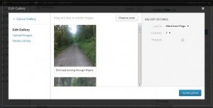
The biggest change that I see in version 3.5 is the new media manager. The interface has changed drastically, and at first I felt that it might be a bit overwhelming for the less tech savvy. After using it, though, I realized it only looked intimidating. It’s actually quite easy to use if you just dive in.
Image galleries have been around since 2.5, but they have never been easy to work with. You had to upload, attach, then manually put the gallery shortcode in. With the new media manager, creating galleries becomes trivial. You can drag and drop the images to reorder, caption them quickly, and with button-click ease, insert them into you posts.
I had always been frustrated by the lack of a good image gallery in WordPress. The NextGEN Gallery plugin always filled the gap, but with the improvements, I have started removing NextGEN from many of my sites. NextGEN’s image arrangement was always lacking, I thought. While it gives you nice pop-ups for each image in the gallery, site visitors can’t comment on individual images, which I hate. I guess it depends on what you are looking for out of your image gallery. I will still use NextGEN in given situations, but it won’t automatically be installed on new sites anymore.
Another new function of the media manager is the ability to insert several images into a post at once, then write the post around the inserted images. I tend to write first, then insert images later, so I’m not sure how useful this will be for me, but I can see how others would find it useful.
New Default Theme
Seeing as how it’s almost 2013, I guess it was just about time for the Twenty Twelve theme release. It’s everything that Twenty Ten and Eleven were, updated and kept light. It’s a fine default theme and its look stays pretty consistent across various devices. As they say on the About page: simple, flexible, and elegant.
Dashboard Resolution Improvements
Even on smaller screens, the WordPress dashboard could get a little grainy if you zoomed in. On higher resolution devices, it could get a little grainy if you stood across the room. Well, no more, even when zoomed in as far as you can. It’s eye candy for the backend, for sure, and really doesn’t have the slightest impact on reaching the people you are trying to reach with your website, but it really does look great.
Square Buttons
Speaking of changes that have no impact on reaching people, the buttons are more square now. I know, not Earth-shaking, but I did notice. Moving on…
Behind the Scenes Stuff
There are some things that you might not notice if you’re not a developer. TinyMCE, the editor you more than likely use to edit all your posts, updates to the latest version, as does jQuery and SimplePie.
The XML-RPC WordPress API, which is used to post from your smart phone or tablet, is now always enabled. I see no reason it shouldn’t have always been by default. Saves me a step when setting up a new site, seeing as how that was one of the first options I changed within the first five minutes after setup.
All in All
I’m pretty impressed. It’s a nice release. Seems stable and as speedy as the previous version, and has noteworthy improvements. And I really like the new media manager. And the square buttons.
